 |
| Candlestick Chart |
| More people are familiar with the Candlestick chart, which clearly indicates open, close, high, low of a security and its trend. Candlestick is made up of a slender box and a wick. The slender box represents the price movement of a security in a given period of time. The tip of wick represents High whereas the toe of wick represents Low. |
If the slender box is coloured in RED, known as red candle, the Close is higher than Open, i.e. the performance of the security is satisfactory.
On the other hand, if the slender box is colour in BLUE, known as blue candle, the Close is lower than Open, i.e. the performance of the security is unsatisfactory. See candlesticks description below:
Figure: Red and blue candles
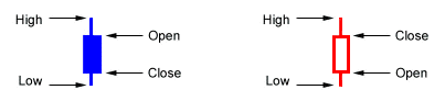
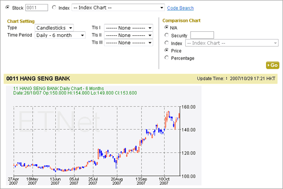
Figure: A candlesticks chart of Hang Seng Bank
 |
|